
SUMMARY
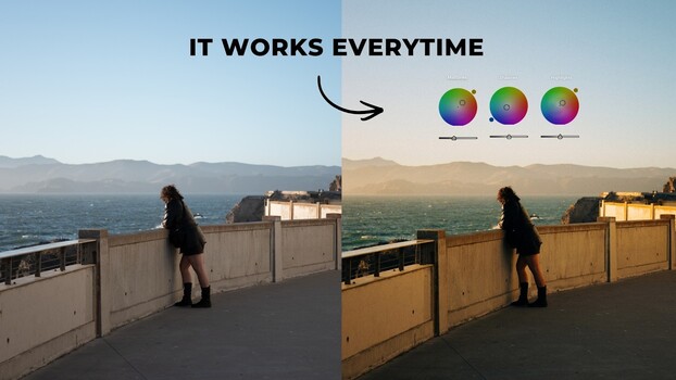
Sean Dalton provides a guide to using Lightroom's color grading panel, emphasizing the importance of setting white balance first. The panel allows independent color adjustments to shadows, midtones, and highlights, unlike the HSL sliders. Dalton demonstrates complementary color combinations, such as blue-orange for general use and green-red for a Fujifilm-like aesthetic, showing real-world examples. He also advises against color fatigue by taking breaks and suggests using subtle adjustments and Lightroom's snapshot feature for comparing variations.
TAKEAWAYS
Use Lightroom's color grading panel for independent shadow, midtone, and highlight color adjustments.
Complementary color pairs like blue-orange and green-red can add depth and mood.
Set white balance before color grading for a neutral starting point.
Take breaks to avoid color fatigue and use subtle adjustments for best results.